
Analysis Overlays
SpicePad can run the same analysis multiple times with different component values and overlay the results in a single plot. This makes it easy to compare how a circuit responds across a parameter sweep — for example, how the cutoff frequency of a filter shifts as you change the capacitance.
The circuit
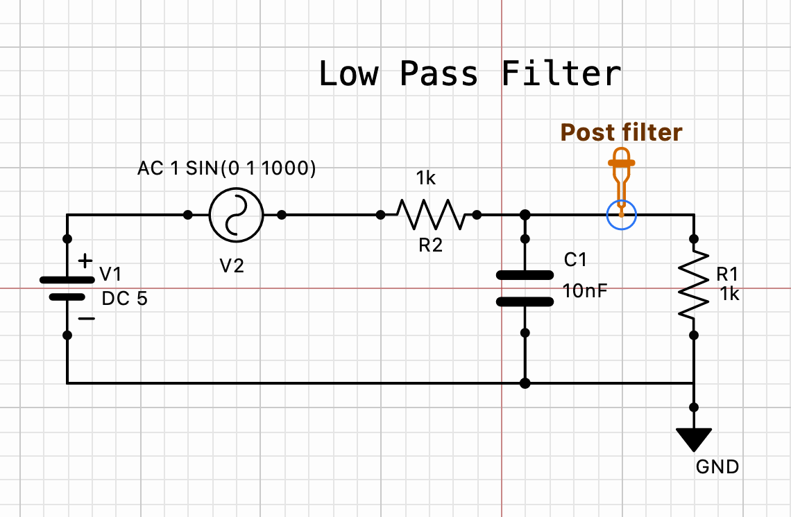
This example uses a low-pass RC filter with an AC sinusoidal source and a single Post filter probe on the output node. The capacitor C1 starts at 10 nF and will be stepped up by a factor of 10 on each loop iteration.
Writing a repeat loop in the Commands box
Open the Simulation Settings panel and enter the following directly into the Commands box. You do not need to use the analysis tabs — the Commands box accepts any valid ngspice .control script.
tran 10u 10m
set curplot = const
let cap = 0.000001
repeat 4
  alter @C1[c] = cap
  tran 10u 10m
  let cap = cap * 10
end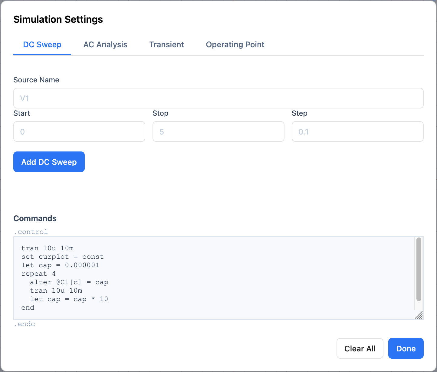
Why set curplot = const?
Every time ngspice runs an analysis it creates a new plot (data space) and makes it the current plot. Any variables that exist in the previous current plot — such as cap — are discarded when that switch happens.
The const data space is a special, persistent plot that is never replaced or destroyed by a new analysis. By switching to it with set curplot = const before defining cap, the variable survives across every loop iteration. Without this line, cap would be lost the moment the first tran inside the loop runs, breaking the sweep.
Running the simulation
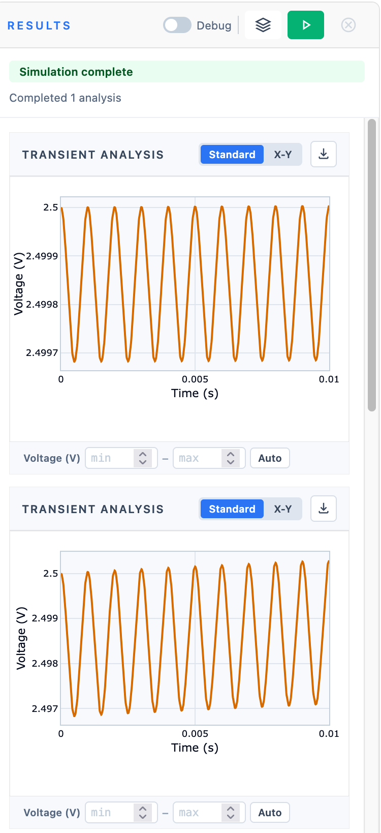
Click Done to close the settings panel, then press the green Run button (▶) in the Results panel toolbar. The loop runs four transient analyses in sequence — each time changing C1 before simulating — and all four results are collected.
The results panel shows each analysis stacked vertically. Notice that the Y-axis scale is different in each plot because auto-scaling adjusts to each individual run — making the traces very hard to compare directly.
You adjust the y-axis scale manually below each plot. But another alternative is overlaying the analyses for easy comparison.
Overlaying the analyses
Click the overlay button (the stacked layers icon) in the Results panel toolbar. This opens the Compare Analyses view, which plots all runs on a shared axis.
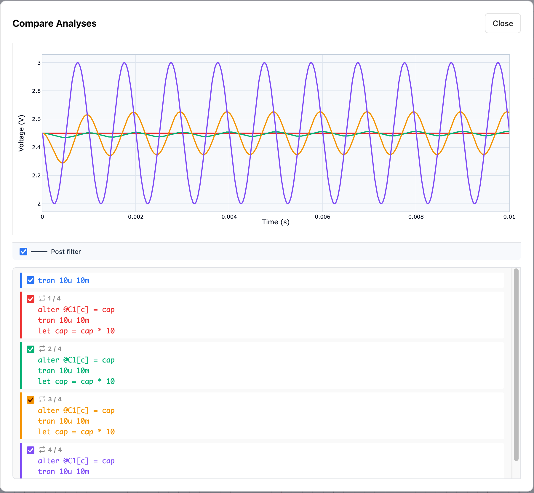
Each loop iteration gets its own colour. The legend below the plot lists every run alongside a checkbox — click any checkbox to toggle that trace on or off. The probe name (Post filter) appears as a separate toggle above the run list; if you have multiple probes, each probe gets its own line style and can be shown or hidden independently.
Tips
- The
alter @C1[c] = capsyntax uses the ngspice instance parameter notation. For a resistor you would writealter @R1[resistance] = val. - You can use
repeat/end,while/end, orforeach/endloops — all standard ngspice control flow is supported in the Commands box.